Saturday, 26 March 2011

Imperial War Museum North


Libeskind's War Museum is strangely compelling. I was thrown off-guard as soon as I entered because all the lights turned off and the huge interior white walls were covered in projections, in videos of recollections/documentaries of past conflicts. These presentations are presumably meant to be as instantaneous as an air raid siren, where visitors rush for a good seat (bomb shelter) before the videos (bombs) start.

The jagged geometry is meant to convey the chaos, the destruction of war, an architectural message that is hard to argue with. I was speaking to one of the staff and Libeskind originally designed the building to be a lot larger, a lot more jagged, and to be clad in concrete - perhaps to present visitors with a bomb-shelter aesthetic. Budget constraints meant the building is now clad in zinc, which I think will be more future-proof than a concrete structure of the same geometry. The zinc in the picture above almost looks like armour, protecting the museum.


A small entrance fee and I found myself at the top of the building, a viewing gallery looking directly at the BBC's new HQ in Salford, across the river/canal... which may or may not be idyllic enough to force Londoners to leave their jobs at BBC London for a new job at BBC Manchester. This building is very keen to show off its cross-bracing, but the other offices on the site looked very disappointing, dull, grey... not at all suited to one of the most cloudy cities in the UK, and hardly vibrant enough to force people to switch jobs, move families etc to Manchester.


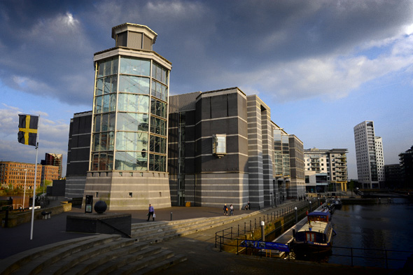
Royal Armouries, Leeds

The Royal Armouries was apparently not planned for Leeds, but the large collection was opened due to lack of space in wherever Plan A was. Plan B, Leeds, is fairly uninteresting from the outside, but walking through the ever-desolate Clarence Dock, the entrance (below) looked quite appealing. The large glass wall and the huge 'FREE ENTRY' signs combine to attract quite a large number of people to the building. 


The collections are excellent, but I shall write about the architecture instead, as the internal layout does well to display them. The main design feature I noticed was that the entrance is at the opposite end of the building to the circulation. This means that visitors walk under all these bridges in the atrium and are offered glimpses of the displays before they arrive at them.


The circulation is important to the building. The winding staircases wrap around a collection of spears, swords and the like, so whilst the circulation seems disconnected from the main body of the building, the visitors still have a lot to look at as they ascend into the upper floors. The glass lifts also enforce the views of the exhibits - there is nowhere in the building I could find (other than WCs) that felt disconnected from the collections, i.e. it was always apparent I was in a museum.


The monotonous grey engineering brick covering more or less the entire building didn't really promote the building on the grey, overcast day I visited... in fact it looked pretty awful. The picture from the AJ, above, on a clear day even makes the building look ugly. The museum is vast - like any good museum there is something new to discover in both the collection and the building each time I visit, but I can't help feeling that the exterior doesn't promote the collection, neither does it make Clarence Dock look any more appealing.

Saturday, 19 March 2011

Accordia: External Spaces

After visiting Accordia in Cambridge, I was asked to do a study of the external spaces of the FCB Studio's Stirling Prize winning housing scheme. 


Site Plan:


3 strong existing corridors of trees helped to frame the development, and are used as a privacy screen between different blocks . No large trees were felled in the construction of Accordia 


I'll use this section to demonstrate the different external spaces within the scheme:


Public Spaces:


Narrow roads and wide pavements create pedestrian-friendly spaces :


Shared Spaces:


Communal spaces are provided in the form of courtyards and internal avenues. Within these spaces, orchards have been planted with the intention that the space should also allow for food production 


Private Spaces:


(Private Gardens)


Streets:


Cars and Parking

Wide pavements, narrow roads and no road markings help to reduce traffic speed; as do the right - angled junctions and tight sightlines where drivers’ views are deliberately impeded.  Streets are left relatively free of cars due to large garages.  If residents park in the narrow street, the 6-7m wide spaces become dysfunctional. The street parking is therefore self policed. This forces residents to rethink owning numerous cars, and reinforces the city’s positive attitude towards cycling. 


Diagram shows traffic routes in orange:

Only one entrance and exit to site also slows traffic .

The architects wanted to create a  

‘more pedestrian and cycle dominated environment’

…and to

‘blur the boundaries between vehicular and pedestrian routes’


Parkland:


Overall Site Area – 9.5 hectares

Public Gardens – 3 hectares

Landscape – 100,000 plants


Wednesday, 16 February 2011

Wren's Library, Cambridge

When walking around potential design/building sites in Cambridge, we took a detour to Wren's Library.

No photos were allowed in the library itself, so the internal images are taken from the University website

The first thing I noticed when approaching the building was that the entire ground floor seemed to have no purpose to it - giant stone columns support the library on the first floor above.


An enquiry and I found out that at the time Wren designed it, the neighbouring River Cam was much more likely to flood, as the Fens had not been properly drained so water levels would often do damage to nearby buildings. To prevent damage to the collection of books, Wren raised the library up a level, and designed a number of large windows to let as much natural light in as possible, which even on a cloudy day when I was there, let in a comfortable amount of light to see my way around.


With all the beautiful views out to the river and nearby university buildings, it seemed strange that Wren would design the windows so high up, so nobody could see out of the building. This could be to prevent damage to the priceless books, that now seem to be a tourist attraction, as the university has a much larger, purpose built library on another site. 


It was interesting to hear about the modernisation of the library. Although completed in 1695, staff were working on computers, and I saw lamps on the desks. Students need to book appointments to visit and read in the library, and all of the books have been scanned so hopefully they will last another 300+ years. Wren designed all the furniture, but additional tables have been made to his specification, and these house the celebrated books. The bookcases that were intentionally left empty in 1695 to house future books have all been filled, and the tourist and student entrance is at opposite ends of the room. 

The location of the windows, the flood-proofing and the attention to detail should all help me when designing my library in the city.

Wednesday, 22 December 2010

Shrewsbury

In this quick entry I have gathered images of my favourite buildings from my home town, Shrewsbury, for no real reason other than architectural interest.

The odd St Chad's Church

The market hall is one of my favourite 'new' builds in the town. The old market hall was restored 'to its former glory' by Arrol & Snell architects, with the inclusion of a small upstairs cinema (I guess 100 seats). I watched the film Gainsbourg there in the summer - it is the sort of place you buy a coffee and where you sit on a sofa and put your coffee on a coffee table. The whole experience is much more enjoyable than going into a packed cineworld/vue/odeon cinema, and it is worth the extra pound or so, despite the small film choice:


It's hard to talk about the architecture of Shrewsbury and not mention anything Tudor. In amongst all the awful new 'mock-Tudor' shopping centres and cheap bars are some absolute (genuine) gems, that are unbelievably still standing. 


It is also a good example of the primitive Tudor way of getting more from their building site by building outwards on the upper levels, as Tudors were at one time only taxed on their initial ground footprint.


Finally, Rowley's House Museum, the biggest Tudor building in the town, is the main museum that attracts the tourists, and continues to dent their foreheads with its very low beams:


Finally there's a new addition to Shrewsbury, the large sculpture named 'Quantum Leap', celebrating 200 years of Charles Darwin, the 'town's favourite son'. The sculpture is giant, 12m high by nearly 20m long and it weighs over 200 tons.

It is similar to the 'Meaning Models' project I was set in the first year of architecture, so it's hard for me not to look into its meanings behind it: Could it be the spine of an animal, twisting... evolving? A strand of DNA? Could it be reflective of the struggle Darwin went through to get his ideas listened to? Bridging the gap between science and religion? Who knows.


Please see my blog entry 'Unbuilt Shrewsbury' for a few 'might-have-been'(s):


Bruges in Winter

I visited Bruges just before Christmas to do the traditional touristy/Christmas market thing, making a number of stops at interesting buildings in the small city centre.

First Impressions: The canals were frozen, as were the tourists. I luckily managed to miss the winter 'travel chaos' by travelling my Eurostar, and once my connecting train arrived into Bruges it was a bit like stepping out into a Narnian landscape. Snowball fights, frozen canals and picturesque little houses all with roaring fires filled the landscape.


The focal point of the city is the city's Belfry/Belfort Tower, that I used to navigate my way around. There used to be a spire on top of the tower, but this was destroyed by lightning, so all that remains is a relatively flat roof. Annoyingly I can't find a picture of the original design, but it's still hard to imagine a further spire on top of the existing building. Wikipedia proudly tells me that there are 27.5 tons of bells in the tower, a deafening noise at the (cramped) top when overlooking the city. 


I think the tower's success is that it forms an immediate focal point for the city. All the main shops/bars/restaurants are centred around it - even Christmas market stalls, an ice rink and a Salvador Dali exhibition are located underneath it. Every city needs one!

What I enjoyed about the architecture in general around Bruges was that no two buildings were the same. It was easy to draw parallels to my first year of architecture, when a brief was to design a slim terraced house of given dimensions, and place the design next to every other students' work, thus creating a row of terraced houses with much character and each house very different from its neighbours. 


Although window heights were more or less the same, and the stepped brick roofs that I had come across in The Netherlands seemed to follow similar dimensions; the width, colour, horizontal window placement and sometimes type of brick, were all different. This made for no dull street in the city. 


One of my unexpected favourite architectural gems were the (last remaining) four windmills that lined the perimeter of the city. These were closed in winter, but signs told me that they were originally used for grinding grain, but now helped (somehow) control water levels in Bruges. 


The designs look quite rudimentary, surely one of the cheaper tourist attractions in the city; but they still maintain their charm with each windmill being painted a different colour. The artificial mounds they stand on help raise the buildings to catch the wind, offer good views of the city, and double up as great sledging opportunities. 


Friday, 19 November 2010

National Glass Centre

I had to visit the National Glass Centre in Sunderland as part of a technical project study assignment, but thought it was worth writing a quick blog about it too. It was raining heavily when I visited the building, so all the exterior photos in this blog are all sourced from Gollifer Architects' website.

The first thing you see when approaching the building is two giant chimneys, that I was to later learn were for distributing the fumes of glass-making high away from visitors below. The architect's website lists shipbuilding as an inspiration for parts of the design, and the chimneys do seem to have a nautical look about them:


The unusual thing about the entrance to the building was that you enter on the roof level and walk down into the building. Before I entered however I walked around the roof, which sloped up slightly towards the River Tees. The glass floors on the roof were fun, although not as scary as other glass floors I've walked on, due to the glass not being 100% transparent. There was a separate 'glass walk' section that I had heard so much about, but on a rainy day the effect wasn't as striking as in this image below:


Once inside the building, to the left and right were some small exhibition spaces, and straight in front was a large double height cafe and shop area, with an interesting conference pod at the end (my photo):


It wasn't until I picked up a building floor plan that I discovered I had missed out the majority of the building though. The north of the building was home to a large glass blowing studio, where a number of students were working on interesting glass sculptures and ornaments. At this time I was thinking of designing a glass-blowing factory and showroom on Murano for my design work, so I quickly became interested in everything that happened in this space. My photo below demonstrates the functionality of the space - with pipes and extractors positioned pretty much everywhere. I had no idea this space existed because all of the photos I had seen of the building were of the exterior:


A success of the building in my opinion was the huge glass façade facing south across the river. The architects wanted to create a transparent building, that engaged with the ship building yards and the river Tees, but in doing so they had to set back the façade several metres under the roof to prevent the summer sun baking the building (the picture below demonstrates this well). Solar shading was implemented also to stop glare from winter sun. Speaking to the people working there, however, they mentioned the building gets particularly cold in winter because of this wall of glass.


I enjoyed walking around the building - I was visiting primarily to look at the architecture, but I was sucked into the interesting exhibitions, and spent a while listening to a talk about glass blowing. The structure didn't leave much to the imagination - every pipe and vent was left showing, which will surely help my technical building study.