Saturday 17 September 2011

'How's Leeds Arena doing?'

In short, it is progressing well. I was observing construction on Thursday/Friday from 20 floors up in Opal Tower, immediately East of the Arena site; and saw perhaps 30 - 40 workers on site looking very busy indeed. Groundwork looks to have been completed, and so the easy above-ground construction is underway. The cores have all more or less reached full height (workers were finishing the northernmost core this Saturday morning) and the first sections of permanent steelwork have been bolted together joining the south-western core, (which is located at the front right of the Arena once completed).

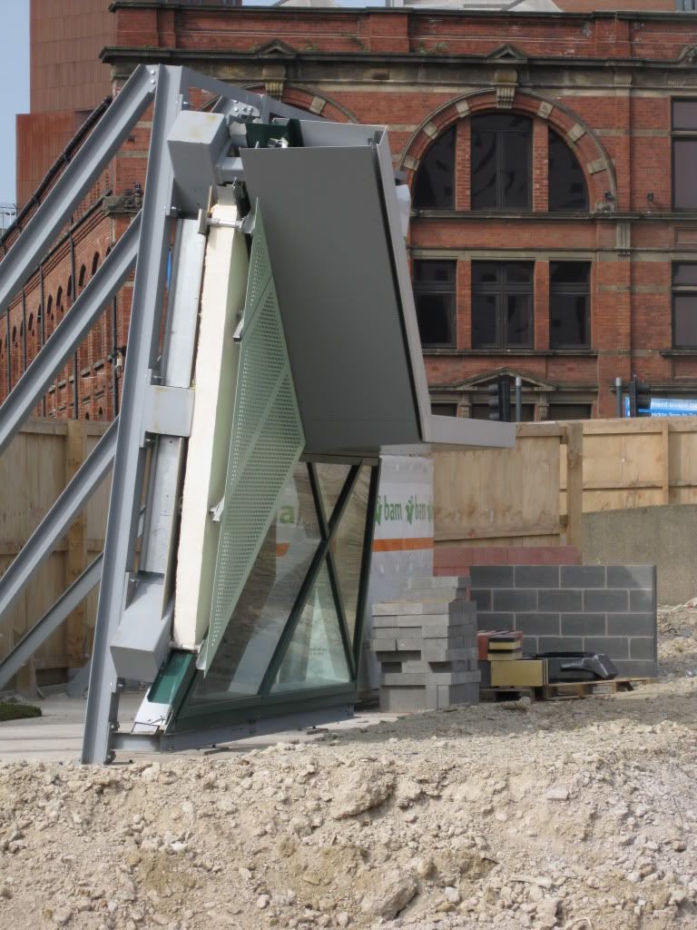
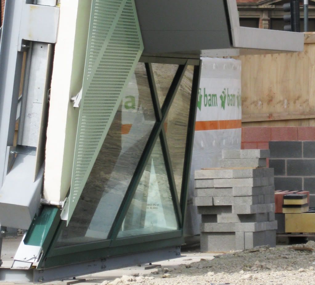
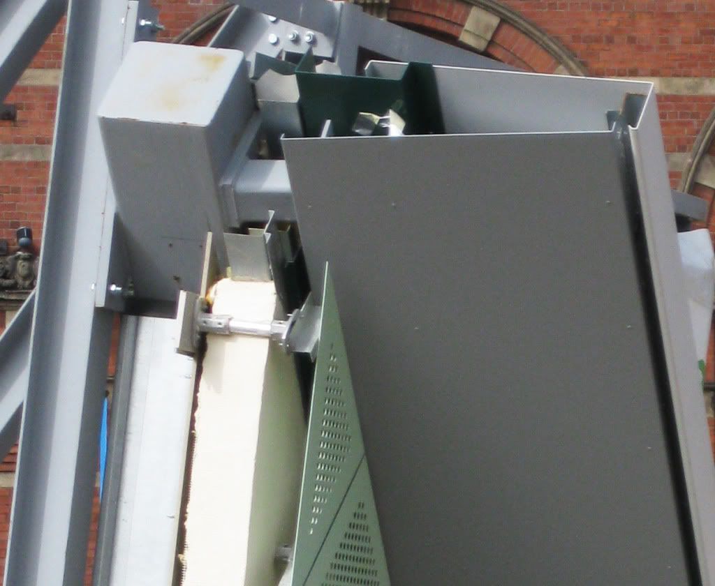
Pictures below (you can see the noticeable change in steelwork during the 24 hour period between Thursday and Friday): Click to enlarge:


On another note it was refreshing to see so much development in Leeds on my walk up the city to the arena site. On approaching Leeds the Bauman Lyons scheme at Tower Works is beginning to take shape, with what I presume is the first phase of brick clad office space located next to the largest, most ornate tower.

Leaving the train station, Leeds Trinity shopping centre is well underway - its domed roof visible from a number of places around Leeds, perhaps echoing the roof of Leeds' Corn Exchange (or perhaps just the roofs of Cabot Circus in Bristol and the New Riverside in Shrewsbury, all designed by the same architects). Just north of Leeds' desirable shopping area lies the student friendly Merrion Centre, which is undergoing a re-clad. I am a bit concerned that when the Arena opens the immediate landscape outside - its busy road, narrow pavements & Merrion Centre won't exactly be the most desirable place for 13,000+ visitors to wander about. Oh well.

Sunday 5 June 2011

The Hepworth, Wakefield

David Chipperfield's new gallery space for Barbara Hepworth's sculpures (and other artists' work). Below, external view - not my photograph. The site is on the banks of the River Calder, and the gallery rises from the river like cliffs from the sea. The industrial aesthetic is quite apparent, the pitched roofs of warehouses populate the short walk from the train station to the gallery. The location therefore is excellent - unlike, for instance, the Royal Armouries in Leeds and The National Glass Centre in Sunderland, which are just about in the middle of nowhere hence the poor visitor numbers.


The facade was constructed from a number of identical concrete panels, and these panels were the smoothest concrete I've ever felt. Not that I've felt much smooth concrete, or know much about smooth concrete. Whenever I try and make concrete I always end up with a crumbly grey mess.


I was chatting to a gallery assistant who had written her dissertation on the design of the building who was so relieved that Chipperfield won the RIBA competition to design the gallery and not, for instance, Hadid. Each of the gallery spaces were designed to house a certain exhibit - some of Hepworth's sculptures are huge and require tall ceilings, natural light etc. Because the gallery mainly houses sculptures and not light-sensitive paintings, it meant that the design team could place windows much more freely than in a conventional gallery. These windows are located on the external edge of the facade, meaning that the reveals from the inside are deep, I'd guess 600-700mm. These are well placed to give specific views over the river, external exhibits and Wakefield cathedral.


I was not allowed to take photographs of the sculptures, but I was more interested in the light-wells above them anyway. The light detailing on every gallery space was similar - the roof light was only visible if you were right up against the wall. The angled roof and white walls meant that natural light flooded down onto Barbara's sculptures in the centre of the gallery. These light voids were opposite the window openings.


I noticed that these sky lights had blinds to control the sunlight, and also noticed a bit of archi-cheating - there were also artificial lights that boosted the amount of light that reflected down into the gallery. These weren't that obvious in June, but I'd imagine might become more clear in the winter months. I wasn't too impressed by the spotlights hanging from the ceiling but I'd imagine this is probably the best (and mot flexible) way to focus light on certain exhibits:


Sunday 27 March 2011

Leeds Arena (Under Construction)

I had a quick look at the site of Leeds Arena earlier, which with its green honeycomb facade will be Leeds latest large piece of modern architecture in the city, due to be completed in two years time. This video shows a very directional piece of architecture - a vibrant, dynamic facade (based on a Voronoi diagram) facing west and its backside facing the motorway and the student accommodation behind (east).


The Facade:


At the moment the site is still being cleared, groundwork is starting so there is no real construction work to follow... but I did manage to take some photos of the facade cladding test, which looks interesting:


What struck me was the level of extrusion of the grey element here, which looks maybe 500mm further out than the rest of the cladding. The front of the Arena will look especially three-dimensional with all these different layers of cladding.


The insulation(?) looks clumsy here but it'll be hidden behind a damp proof layer, and neither will be particularly visible once the green triangular pieces are added in front. 


These green pieces remind me of Alsop's green triangles in Headingley - they are not solid pieces - they are punctuated to reduce weight/add interest etc.

Saturday 26 March 2011

Leeds' Victoria Quarter


A friend of a friend (of a friend...) is the manager of the Victoria Quarter, and in his office he let me and a few students take photographs of some of the original drawings for the shopping centre (calling it a shopping centre really degrades it!):


What we also found were drawers and drawers full of the architects initial drawings, planning applications for the development. These drawings are beautiful and should be displayed permanently in either the boutique shopping centre or somewhere else in Leeds. They are far too good to be tucked away in a filing cabinet underneath the plant room of Harvey Nichols...


Finally some photos of the Victorian-style arcades, probably the most attractive area in Leeds, and a much more enjoyable shopping experience than anywhere else in the city or anywhere else I can think of. Don't mention 'Las Vegas'


Imperial War Museum North


Libeskind's War Museum is strangely compelling. I was thrown off-guard as soon as I entered because all the lights turned off and the huge interior white walls were covered in projections, in videos of recollections/documentaries of past conflicts. These presentations are presumably meant to be as instantaneous as an air raid siren, where visitors rush for a good seat (bomb shelter) before the videos (bombs) start.

The jagged geometry is meant to convey the chaos, the destruction of war, an architectural message that is hard to argue with. I was speaking to one of the staff and Libeskind originally designed the building to be a lot larger, a lot more jagged, and to be clad in concrete - perhaps to present visitors with a bomb-shelter aesthetic. Budget constraints meant the building is now clad in zinc, which I think will be more future-proof than a concrete structure of the same geometry. The zinc in the picture above almost looks like armour, protecting the museum.


A small entrance fee and I found myself at the top of the building, a viewing gallery looking directly at the BBC's new HQ in Salford, across the river/canal... which may or may not be idyllic enough to force Londoners to leave their jobs at BBC London for a new job at BBC Manchester. This building is very keen to show off its cross-bracing, but the other offices on the site looked very disappointing, dull, grey... not at all suited to one of the most cloudy cities in the UK, and hardly vibrant enough to force people to switch jobs, move families etc to Manchester.


Royal Armouries, Leeds

The Royal Armouries was apparently not planned for Leeds, but the large collection was opened due to lack of space in wherever Plan A was. Plan B, Leeds, is fairly uninteresting from the outside, but walking through the ever-desolate Clarence Dock, the entrance (below) looked quite appealing. The large glass wall and the huge 'FREE ENTRY' signs combine to attract quite a large number of people to the building. 


The collections are excellent, but I shall write about the architecture instead, as the internal layout does well to display them. The main design feature I noticed was that the entrance is at the opposite end of the building to the circulation. This means that visitors walk under all these bridges in the atrium and are offered glimpses of the displays before they arrive at them.


The circulation is important to the building. The winding staircases wrap around a collection of spears, swords and the like, so whilst the circulation seems disconnected from the main body of the building, the visitors still have a lot to look at as they ascend into the upper floors. The glass lifts also enforce the views of the exhibits - there is nowhere in the building I could find (other than WCs) that felt disconnected from the collections, i.e. it was always apparent I was in a museum.


The monotonous grey engineering brick covering more or less the entire building didn't really promote the building on the grey, overcast day I visited... in fact it looked pretty awful. The picture from the AJ, above, on a clear day even makes the building look ugly. The museum is vast - like any good museum there is something new to discover in both the collection and the building each time I visit, but I can't help feeling that the exterior doesn't promote the collection, neither does it make Clarence Dock look any more appealing.

Saturday 19 March 2011

Accordia: External Spaces

After visiting Accordia in Cambridge, I was asked to do a study of the external spaces of the FCB Studio's Stirling Prize winning housing scheme. 


Site Plan:


3 strong existing corridors of trees helped to frame the development, and are used as a privacy screen between different blocks . No large trees were felled in the construction of Accordia 


I'll use this section to demonstrate the different external spaces within the scheme:


Public Spaces:


Narrow roads and wide pavements create pedestrian-friendly spaces :


Shared Spaces:


Communal spaces are provided in the form of courtyards and internal avenues. Within these spaces, orchards have been planted with the intention that the space should also allow for food production 


Private Spaces:


(Private Gardens)


Streets:


Cars and Parking

Wide pavements, narrow roads and no road markings help to reduce traffic speed; as do the right - angled junctions and tight sightlines where drivers’ views are deliberately impeded.  Streets are left relatively free of cars due to large garages.  If residents park in the narrow street, the 6-7m wide spaces become dysfunctional. The street parking is therefore self policed. This forces residents to rethink owning numerous cars, and reinforces the city’s positive attitude towards cycling. 


Diagram shows traffic routes in orange:

Only one entrance and exit to site also slows traffic .

The architects wanted to create a  

‘more pedestrian and cycle dominated environment’

…and to

‘blur the boundaries between vehicular and pedestrian routes’


Parkland:


Overall Site Area – 9.5 hectares

Public Gardens – 3 hectares

Landscape – 100,000 plants


Wednesday 16 February 2011

Wren's Library, Cambridge

When walking around potential design/building sites in Cambridge, we took a detour to Wren's Library.

No photos were allowed in the library itself, so the internal images are taken from the University website

The first thing I noticed when approaching the building was that the entire ground floor seemed to have no purpose to it - giant stone columns support the library on the first floor above.


An enquiry and I found out that at the time Wren designed it, the neighbouring River Cam was much more likely to flood, as the Fens had not been properly drained so water levels would often do damage to nearby buildings. To prevent damage to the collection of books, Wren raised the library up a level, and designed a number of large windows to let as much natural light in as possible, which even on a cloudy day when I was there, let in a comfortable amount of light to see my way around.


With all the beautiful views out to the river and nearby university buildings, it seemed strange that Wren would design the windows so high up, so nobody could see out of the building. This could be to prevent damage to the priceless books, that now seem to be a tourist attraction, as the university has a much larger, purpose built library on another site. 


It was interesting to hear about the modernisation of the library. Although completed in 1695, staff were working on computers, and I saw lamps on the desks. Students need to book appointments to visit and read in the library, and all of the books have been scanned so hopefully they will last another 300+ years. Wren designed all the furniture, but additional tables have been made to his specification, and these house the celebrated books. The bookcases that were intentionally left empty in 1695 to house future books have all been filled, and the tourist and student entrance is at opposite ends of the room. 

The location of the windows, the flood-proofing and the attention to detail should all help me when designing my library in the city.